gateTree Demonstration
Published:
A user-informed clustering tree algorithm for cell population identification in flow cytometry data.
Install gateTree.
remotes::install_github("UltanPDoherty/gateTree")
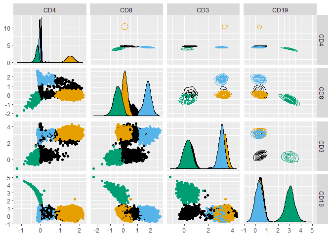
Load and plot data from the healthyFlowData package.
library(healthyFlowData)
data(hd)
hfd1 <- hd.flowSet[[1]]@exprs

GGally::ggpairs(hfd1, upper = list(continuous = "density"), progress = FALSE)
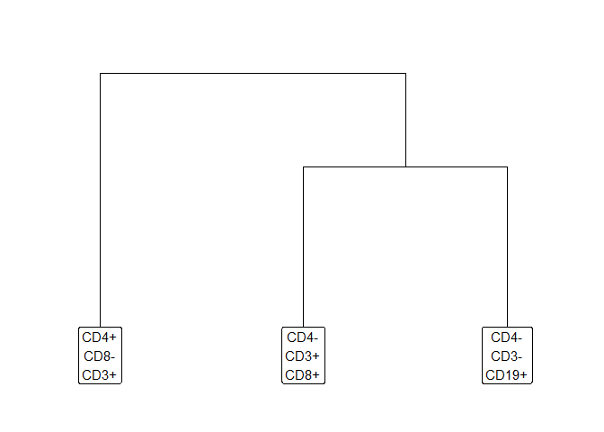
Prepare a plusminus table which describes three populations.
- CD4+ T Cells (CD4+CD8-CD3+CD19-)
- CD8+ T Cells (CD4-CD8+CD3+CD19-)
- B Cells (CD4-CD8-CD3-CD19+)
plusminus1 <- as.data.frame(rbind(
  "CD4+_T" = c(+1, -1, +1, -1),
  "CD8+_T" = c(-1, +1, +1, -1),
  "B"      = c(-1, -1, -1, +1)
))
colnames(plusminus1) <- colnames(hfd1)
plusminus1
##        CD4 CD8 CD3 CD19
## CD4+_T   1  -1   1   -1
## CD8+_T  -1   1   1   -1
## B       -1  -1  -1    1
Excel can be used to save or create tables (openxlsx package).
openxlsx::write.xlsx(
  plusminus1,
  "~/plusminus.xlsx",
  rowNames = TRUE,
  colNames = TRUE
)

plusminus2 <- openxlsx::read.xlsx(
  "~/plusminus.xlsx",
  rowNames = TRUE,
  colNames = TRUE
)
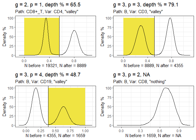
Run the gatetree function.
hfd1_gatetree <- gateTree::gatetree(hfd1, plusminus2,
  min_scaled_bic_diff = 50,
  min_depth = 10,
  show_plot = c(TRUE, FALSE)
)
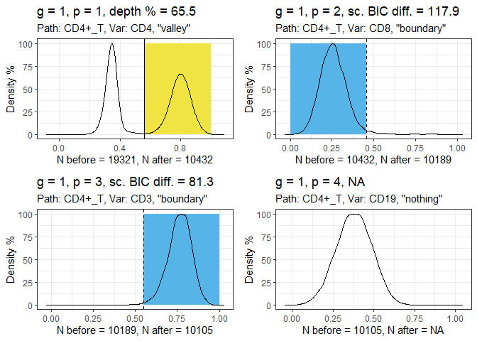
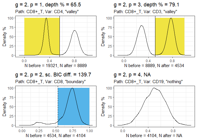
Plot the tree diagram.
hfd1_gatetree$tree_plot +
  ggplot2::scale_y_continuous(expand = c(0.1, 0.1)) +
  ggplot2::scale_x_continuous(expand = c(0.1, 0.1))
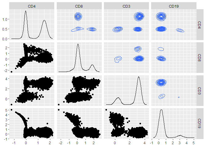
Plot the data, coloured according to the gateTree labels.
GGally::ggpairs(hfd1,
  progress = FALSE,
  upper = list(continuous = "density"),
  ggplot2::aes(colour = as.factor(1 + hfd1_gatetree$labels))
) +
  ggokabeito::scale_colour_okabe_ito(order = c(9, 1, 2, 3)) +
  ggokabeito::scale_fill_okabe_ito(order = c(9, 1, 2, 3))